I've decided to kick the tyres of the iOS 26 public beta after reading about people saying it was more stable than iOS 18 (not difficult). I've only used it briefly but I thought I'd write down my first impressions.
I was rather skeptical of Liquid Glass when the first screenshots were being mocked by the internet, but Apple toned it down and it feels really subtle to me.
I'm not a huge fan of the light reflection effect on the icons – it doesn't look that great to me, it feels more like a white border, but I'm sure I'll get used to it. Same with the gradient that Apple has applied to them. I do like the app folder view though!
The animations feel smoother and kinda nicer but I'm not sure why.
Many of the core apps seem to have been simplified. The new Photos in iOS 18 was universally recognised as awful, but now most of the complexity has been hidden away. You have two options: Library and Collections, plus a search icon in the bottom corner. Start to scroll and you see the Years / Months options. It feels much more natural to me.
However, “special scene”. Seriously, WTF?! How can I remove this?
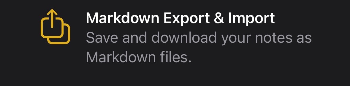
When I fired up Notes I saw this message – this feels like a big deal?
The new menu bar of Safari needs work.
I mean 🙈
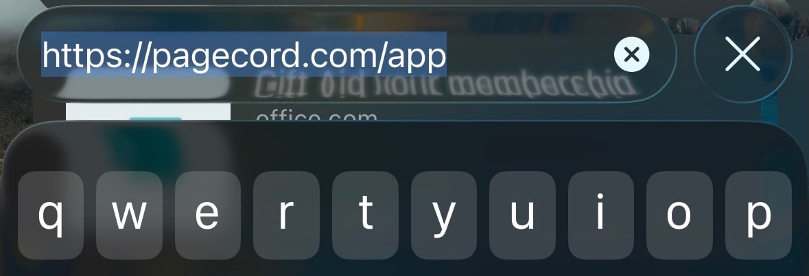
There are now two context menus here as well which is confusing, at least to me. This floating menu looks bad but when you tap on the URL to type a new one in, it looks terrible.
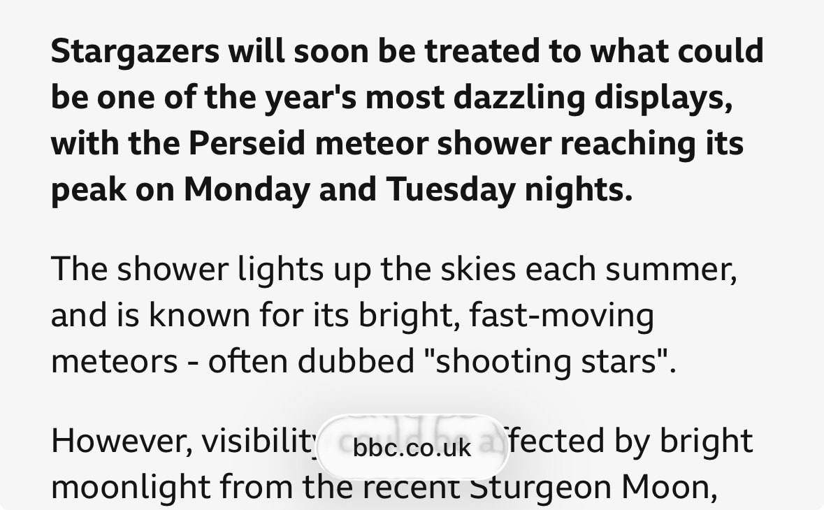
I do quite like the way it all hides away as you scroll to allow you to focus on the reading. It just looks pretty bad on white websites which is, y’know, most websites. Can you spot it?
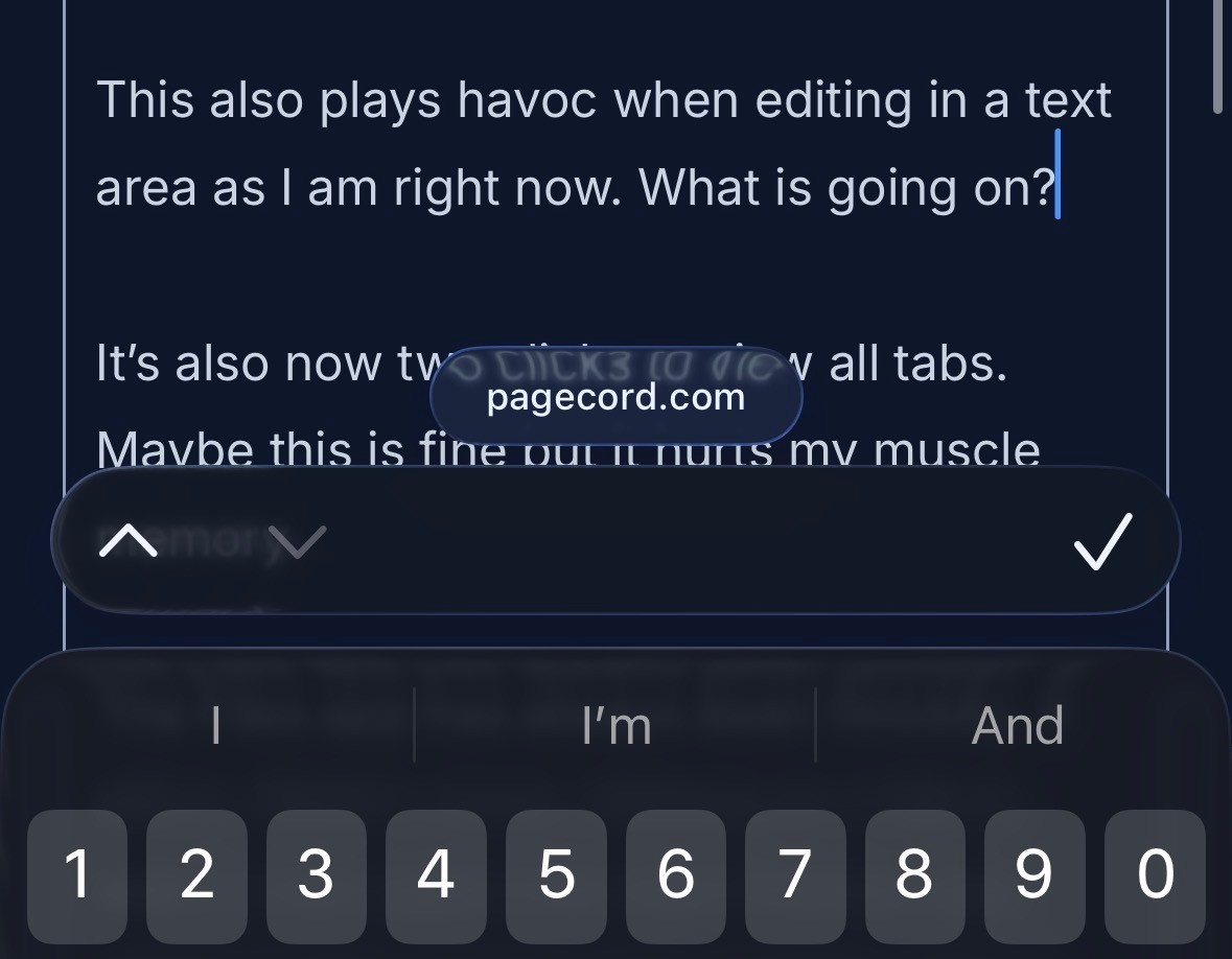
This also plays havoc when editing in a text area as I am right now. What is going on?
It’s now two clicks to view all tabs in Safari. Maybe this is fine but it hurts my muscle memory. I suppose you can think of it as now being a double tap, which work tbh.
The Files app has always been finickity. It still is. What's more, clicking on a file to view it now opens the new Preview app which is fine, but it's now another click to get back to files (it lands you in Preview and there you stay). I haven't played with Preview enough to have a strong opinion, but it feels like a step forward for sure.
Messages looks the same to me, but I don't use it a lot (WhatsApp won). Same with email (I use the Fastmail app), although I do like the new Mail icon.
That's all I've really used so far. As I say, just some first impressions, but it definitely feels like it will be a very solid release. Thank goodness for that!