The plague of offering a free website/blog platform is the spammers. They’re relentless. I’ve largely automated spam detection now, but it’s eye-rolling to see them keep trying, day-in, day-out. Here’s a prime example.
Try harder, bots.

Scotland comes to Boston for the World Cup ❤️
Biggest IPO of all time and Musk’s speech is a 5 sentence sci-fi B movie word salad that literally makes no sense. That’s all you got?
I always think about this. There are always problems on earth. There’s always things that we wish to be better, that we want to solve here on Earth, and we should solve them. But there also have to be things that get you excited about the future - that make you glad to wake up in the morning, because you can’t wait to see what happens next. And that’s the future SpaceX wants to bring to you.
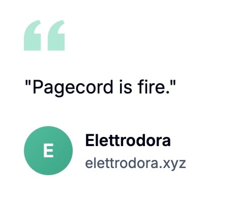
Testimonials don't get any better than this imo.
If you visit a website you should ... see the website. See its content. Be able to read the article whose page you are attempting to visit. Showing a “subscribe to our newsletter” or “accept our fucking cookies” dickover to someone trying to read an article on the web makes no more sense than sending out an email newsletter that only contains a link to read the newsletter on a webpage. A webpage should show the webpage. An email should show the email. I should not have to explain this.
— John Gruber, What is a Dickover?

I just spent an hour or so tightening the Pagecord home page copy and the ordering of content sections. I'm not sure if this will make any difference, but I certainly prefer it. Do you? I need to redo the walkthrough video at some point as the current one is cringe and it pre-dates a bunch of features.
I know Pagecord has product market fit because of customer feedback (I've been soliciting this) and conversion rates, and it's very feature-rich today, so my focus now has to be about getting more people to try it. Copy and SEO is part of that, but it's clear that demand for personal websites and blogging appears to be continuing to slump, plus the number of competing products continues to grow. Tough situation. I'll keep trying things. I'm in a good position since the product is profitable!
My main hope is that existing customers continue to use Pagecord (churn is a major problem for blogging platforms), and also continue to spread the word if they get the chance. A customer's post went viral this week on Hacker News and Reddit which was great to see (and I'm delighted that the server shrugged off this mega-traffic), but they had turned off the Pagecord link in the blog footer so alas I'll never get to know how that might have impacted signups. Maybe it would have made little difference, we'll never know.
Onwards.
Spotify rolled out a new (temporary) logo to celebrate their 20th anniversary. The internet is ablaze with rage because it looks terrible on a phone home screen, but I actually love it myself. It’s playful and fun, and we need more fun in our lives in this age of average. More of this!